This week was the final week of unit BA1a. Finished Character Design and Character Research.
CHARACTER DESIGN
For character design, this final week was simultaneously easy to get through, and very
difficult to get through. I did manage to get everything done, and the easy
part about that is that I already had the bulk of the work done, this week was
just finishing it. The difficult part of it was the overwhelming sense of “what
if it’s wrong” that I had a couple of times. I realise in past blog entries I
mention the development of not being afraid of failure, but this seemed too big
to not be intimidated of at times. But I did manage to get there in the end,
thank goodness. The walk cycle had arms added, and the head was fixed too.
Turnaround finished up with some slight adjustments to keep consistency, and
then that was it. I’m glad I kept on top of it the way I did, making sure to
keep an appropriate balance between work and personal time. Definitely going to
apply that to my next projects. Nothing really to improve on this week, since I’m
at the end of everything and trying to apply what I’d previously said I’d
improve on.
CHARACTER RESEARCH
And the essay is done! I sent off my first draft to our lecturer for
feedback, got some back, and managed to fix it up relatively quickly! This
helped me in a HUGE way; since I was told that once the changes were made I
needn’t send it back, I knew that I could rest easy (relatively speaking) after
the recommended changes were amended. I’m ultimately glad that I did the essay
in the end; those types of research skills will (probably) come in handy in the
future. It also helped me with getting to know characters in a deeper way. Learning every little thing
matters is something I really respect, and want to be able to put into my own
projects and characters in future. I think the only thing I’d change about the
process of making this is go QUICKER. 8 weeks was a good amount of time, but
for a few of those weeks, the essay felt more like an afterthought or something
that wasn’t AS important, thus taking longer. I want to be able to have essays
up front next time, alongside my actual animation tasks.
FINAL THOUGHTS / SUMMARY OF BA1a
Overall, I feel this unit went VERY well! I feel proud of everything I've made, and all the knowledge I've gained is all vital and important not just for future projects, but for my animation career in general. Learning all the principles, different exercises and character fundamentals in terms of both visual design and as functional characters was all so interesting and honestly enjoyable! I can't wait for the next project!
Showing posts with label Character Design. Show all posts
Showing posts with label Character Design. Show all posts
Thursday, November 15, 2018

Tuesday, November 13, 2018
Sunday, November 11, 2018
WEEK 7 SUMMARY
WEEK START - 5th of November
WEEK END - 12th of November
This week was mainly focused around TVPaint animations for our characters, and finetuning details of the essay.
MONDAY
Monday was when we started the animated turnaround of our chosen character. There were a few ways to go about it, including using the previously drawn turnaround. I decided to go from scratch for the turnaround itself, but using my sketchbook and digitally converted cast model as my references.
For more on this session, see this post.
WEDNESDAY
There was a group session held to catch up with our lecturer on our essays, seeing how we're getting on and as an opportunity to ask questions. This was quite helpful for me; while I had my plan and ideas in place, saying them out loud to the person most knowledgeable about what we're meant to be doing helped to validate everything. I was a lot more confident in what I was doing from that point onwards, and knew I was on the right track.
I'm going to email her my draft as soon as it's 100% complete, and hopefully get some feedback to improve it and call it "finished".
I'm going to email her my draft as soon as it's 100% complete, and hopefully get some feedback to improve it and call it "finished".
THURSDAY
Thursday was when people moved onto the walk cycle for their character, also done in TVPaint. I went straight ahead with trial and error methodologies, trying out a couple of ways to achieve the feel I wanted. The walk had to show the weight of the character, and it was quite tricky to do so. Eventually, after some guidance from lecturers and tutors, I managed to get a walk cycle I was happy with!
For more on this session, see this post.
SUMMARY
In short, this week was a lot more difficult than the others I've had so far. The TVPaint turnaround and walkcycles were more fidgety and tricky to work with than I originally thought they'd be. I put some of that onto TVPaint, but mostly inexperience with it was my downfall here. I've been so used to Adobe Animate and it's more forgiving nature, but TVPaint is more for the people who make more art-heavy animations, as opposed to my preferred cartoony, fun styles. I'm probably just going to have to learn to get used to it over time. Either that or I can try and work in Animate in future? We'll see.
The essay is starting to reach the end, and this week put my confidence and drive for it up by a significant amount. I have my sources gathered up and put into a separate bibliography (unalphabetised and unlinked to the essay at this point; will append when essay is 100% ready to go). I might try and find a few more sources though, just to make sure everything I'm trying to say is right and can't be contradicted by anything. I'm using the basic skeleton of my plan from this post, but maybe with a few more sources thrown in? All I know is, this time next week the essay will be done.
Thursday was when people moved onto the walk cycle for their character, also done in TVPaint. I went straight ahead with trial and error methodologies, trying out a couple of ways to achieve the feel I wanted. The walk had to show the weight of the character, and it was quite tricky to do so. Eventually, after some guidance from lecturers and tutors, I managed to get a walk cycle I was happy with!
For more on this session, see this post.
SUMMARY
In short, this week was a lot more difficult than the others I've had so far. The TVPaint turnaround and walkcycles were more fidgety and tricky to work with than I originally thought they'd be. I put some of that onto TVPaint, but mostly inexperience with it was my downfall here. I've been so used to Adobe Animate and it's more forgiving nature, but TVPaint is more for the people who make more art-heavy animations, as opposed to my preferred cartoony, fun styles. I'm probably just going to have to learn to get used to it over time. Either that or I can try and work in Animate in future? We'll see.
The essay is starting to reach the end, and this week put my confidence and drive for it up by a significant amount. I have my sources gathered up and put into a separate bibliography (unalphabetised and unlinked to the essay at this point; will append when essay is 100% ready to go). I might try and find a few more sources though, just to make sure everything I'm trying to say is right and can't be contradicted by anything. I'm using the basic skeleton of my plan from this post, but maybe with a few more sources thrown in? All I know is, this time next week the essay will be done.
Monday, November 5, 2018
CHARACTER DESIGN - TVPAINT FILES
This was the main session focusing on our actual animations for our chosen characters. The animations we had to make were the remaining two bullet points from this post, those being:
We used TVPaint for these animations; we had done a tutorial in the program a week prior, but I still wasn't too used to it. My forte when it comes to digital animation is Adobe Animate, so TVPaint had a steep learning curve. The two work very differently, from small things like shortcuts & hotkeys, to how line smoothing works and TVPaint's pixelated format vs Animate's vector based format.

I decided to tackle the turnaround first, since it seemed like a pretty good stepping on point after learning the basics. Going from the basics straight to a walk cycle seemed daunting, so taking smaller steps and getting to know the program more was important to me and how I work.
I used both my original A3 sketches and my Photoshop files to get my reference for C2, my chosen character, and how they'd look from different angles. The main difference between the animated turnaround and the model sheet, apart from that one moves, is that the model sheet only requires four drawings. In total, C2's animated turnaround took 8; one front, one back, two sides, and four angled. I did 2 or 3 rough sketches for the turnaround, each with a varying amount of detail before moving onto the most "clean" lineart layer. They were all coloured using the paint bucket tool, making sure to set it on a layer below the lineart, and having the source for colouring being the layer above.
Once I finished my turnaround, I showed it Jon (our lecturer) for feedback and criticism. While it was good, I had some adjustments to make to make sure everything stayed in scale correctly. The fingers and jaw moved a little bit throughout the turnaround, looking like they'd bob up and down when nothing else was. Apart from that, I apparently achieved a good sense of space and shape. With the feedback I recieved, I fixed up C2's turnaround to something I'm really happy with!
To top it all off, I added a little bit of lighting. Nothing extravagant, just some block shading using the same colour as C2's cast model shading.
The next task was the walk cycle. I've found walk cycles quite difficult in the past, but I kept my confidence up when approaching this instead of keeping potential failure in mind.
I approached the walk cycle with a different plan in mind than what I originally drew on A3; instead of larger strides, I wanted smaller but more powerful steps, to show the weight of the character. To do this, it meant my guide had to have the exaggeration toned down, and having the movements seem closer together. The legs staying the same shape was a little tricky at times, especially with the top of the foot shifting positions sometimes. When I had completed the full 2 steps, something looked... off. I couldn't put my finger on what it was, so I asked for some help from Millie, a guest lecturer. She pointed out that the weight distribution was uneven, where it looked like C2 was limping. Also, the head bobbing didn't quite look right when going through the low stage of the cycle.
This feedback helped me to clean up the walk cycle to a point that I was happy with it. It took a lot of trial and error to get the limp and head bobbing to resolve themselves, but eventually I got there.
The final step was to add arms. I mainly focused on the one arm facing the "camera", and then worried about the other one when I finished the main one; after all, I could just use the front one as a reference of sorts. It was difficult matching the arm to be in the same believable position every frame, since I initially drew it as if the body was static. However, it was using the transform tool that helped me get a better look. Once the arm was how I liked it, I finished up the walk cycle by mirroring the arm to create the second, lesser seen back arm.
- ANIMATED WALK CYCLE
- ANIMATED TURNAROUND
We used TVPaint for these animations; we had done a tutorial in the program a week prior, but I still wasn't too used to it. My forte when it comes to digital animation is Adobe Animate, so TVPaint had a steep learning curve. The two work very differently, from small things like shortcuts & hotkeys, to how line smoothing works and TVPaint's pixelated format vs Animate's vector based format.
(TVPaint's new file interface - credit: TVPaint Development website)
I decided to tackle the turnaround first, since it seemed like a pretty good stepping on point after learning the basics. Going from the basics straight to a walk cycle seemed daunting, so taking smaller steps and getting to know the program more was important to me and how I work.
I used both my original A3 sketches and my Photoshop files to get my reference for C2, my chosen character, and how they'd look from different angles. The main difference between the animated turnaround and the model sheet, apart from that one moves, is that the model sheet only requires four drawings. In total, C2's animated turnaround took 8; one front, one back, two sides, and four angled. I did 2 or 3 rough sketches for the turnaround, each with a varying amount of detail before moving onto the most "clean" lineart layer. They were all coloured using the paint bucket tool, making sure to set it on a layer below the lineart, and having the source for colouring being the layer above.
Once I finished my turnaround, I showed it Jon (our lecturer) for feedback and criticism. While it was good, I had some adjustments to make to make sure everything stayed in scale correctly. The fingers and jaw moved a little bit throughout the turnaround, looking like they'd bob up and down when nothing else was. Apart from that, I apparently achieved a good sense of space and shape. With the feedback I recieved, I fixed up C2's turnaround to something I'm really happy with!
To top it all off, I added a little bit of lighting. Nothing extravagant, just some block shading using the same colour as C2's cast model shading.
I approached the walk cycle with a different plan in mind than what I originally drew on A3; instead of larger strides, I wanted smaller but more powerful steps, to show the weight of the character. To do this, it meant my guide had to have the exaggeration toned down, and having the movements seem closer together. The legs staying the same shape was a little tricky at times, especially with the top of the foot shifting positions sometimes. When I had completed the full 2 steps, something looked... off. I couldn't put my finger on what it was, so I asked for some help from Millie, a guest lecturer. She pointed out that the weight distribution was uneven, where it looked like C2 was limping. Also, the head bobbing didn't quite look right when going through the low stage of the cycle.
This feedback helped me to clean up the walk cycle to a point that I was happy with it. It took a lot of trial and error to get the limp and head bobbing to resolve themselves, but eventually I got there.
The final step was to add arms. I mainly focused on the one arm facing the "camera", and then worried about the other one when I finished the main one; after all, I could just use the front one as a reference of sorts. It was difficult matching the arm to be in the same believable position every frame, since I initially drew it as if the body was static. However, it was using the transform tool that helped me get a better look. Once the arm was how I liked it, I finished up the walk cycle by mirroring the arm to create the second, lesser seen back arm.
The main theme throughout these tasks was "overcoming difficulties". I'd never had someone to guide me with animations before really, and this was the first time someone helped me go in depth with what could be fixed up and improved with my animations. It proved to be VERY helpful, and honestly not as scary as my mind had made it up to be. Definitely going to be asking for professional feedback from lecturers as much as possible in future!
Sunday, November 4, 2018
WEEK 6 SUMMARY
WEEK START - 29th of October
WEEK END - 4th of November
This week was focused on our casts that we designed, and translating them from pencil & paper to the digital space. We also had a lecture on Harvard Referencing (didn't get a post of it's own, but I'll sum it up here.)
MONDAY
On Monday, we made a sheet consisting of four panels relating to our cast:
- CAST LINEUP
- CHARACTER MODEL SHEET
- CHARACTER DESIGN SHEET
- CHARACTER WALK CYCLE
For more on this session, see this post.

TUESDAY
In place of a regular lecture, we were looking at how to correctly utilise Harvard Referencing for our character essay. In this session, we learnt how to properly cite and reference the following formats:
- Books
- E-Books
- Films
- Commentaries
- Reissued Films
- Webpages
- YouTube Videos
- Newspaper Articles
Aside from those, we also learnt the proper rules and regulations when it comes to quoting & paraphrasing. There was a talk on plagiarism, and how to avoid doing it, by accident or not. Punctuation, common knowledge and different source types (primary & secondary) were also brought up.
THURSDAY
This session was the start of our Photoshop conversion of the physical sketches. For Photoshop, we had to remake:
- CAST MODEL SHEET
- CHARACTER MODEL SHEET
- CHARACTER DESIGN SHEET
For the full writeup of this session, see this post.


SUMMARY
In general, I feel this week went very well! I was glad to be entering the digital art scene for my work, since that's the medium I generally feel most confident drawing in. Nothing really acted up or went wrong, but I definitely areas where I changed things as I went along, both for necessity's sake and because my mind changed on certain design choices. I would only change things that I could do with a little more time, and only if I wanted to, not because I had to. Adding shading to the design sheet, and colour to the entire turnaround would've been preferential, but ultimately it didn't need to be there. Still, I would've liked it.
The lecture on Harvard referencing was very helpful, since most of my sources for The LEGO Movie I could find weren't in books, the only source type we'd been over before. Learning how to properly cite and reference movies, YouTube videos, websites, etc, will all essential to correctly documenting my sources for my essay. The essay is really getting there, I think I have a plan set out at this point. I just need to find relevant and usable sources / evidence to back up each point and I'll be set.
Saturday, November 3, 2018
MY CHARACTERS - BIOS AND INFLUENCES
This post is cataloging my research for each of my characters in my cast, including

NAME: C2 (short for Cuprite-2)
AGE: 5,000 (as a crystal), 2 (since consciousness)
SPECIES: Unknown
PROFESSION: none
C2 is a genderless (yet male-coded) humanoid crystal, based on the cuprite gemstone, a "dark red of brownish black mineral" comprised mostly of copper oxide.


- Real world influence
- Inspiration from other characters
- "Original Ideas"
C2

NAME: C2 (short for Cuprite-2)
AGE: 5,000 (as a crystal), 2 (since consciousness)
SPECIES: Unknown
PROFESSION: none
C2 is a genderless (yet male-coded) humanoid crystal, based on the cuprite gemstone, a "dark red of brownish black mineral" comprised mostly of copper oxide.
(Real cuprite - credit: newsandpr.com)
The dark red colour the gemstone can take on is the main inspiration for Cuprite's colour scheme.
The texture of cuprite is commonly a lot of clean cuts and edges; I brought some of this into the design of the character, when it came to appendages and digits. They have sharper edges, and had the character been created in a 3-dimensional space, the fingers would be less of a coned point, and more of a 4-sided pyramids / obelisks.
C2 wears a black and orange tank top; since the backstory has them be a scientific subject, they needed some kind of uniform from the lab. Since I couldn't find very many striking uniforms that were also appropriate from the science field, I looked further. I eventually settled on something kind of related: a prison jumpsuit. In real life and in fiction, prison jumpsuits are usually bright orange. Given the laboratory that takes C2 is a cruel, near abandoned place, I thought it appropriate that the uniform it gives it's test subjects be similar to prison jumpsuits.
(Harley Quinn in her Arkham Asylum jumpsuit, from "Suicide Squad" - credit: Warner Bros.)
In regards to shape theory, C2 is made up of triangles and squares. The triangles are supposed to be subversive, and also go with the story. The lab wants to weaponise C2, making their unique abilities into tools of war. However, C2 isn't a fan of that idea. So the triangles represent that C2 can be dangerous, but doesn't want to use that power. The squares, commonly used to show stability and safety, is more so used to show level-headedness and a need to keep those who it respects safe.
C2 is also amorphous. This essentially means it is without a definite form, and can shapeshift at will. However, this can only be done with a finite volume of crystal; for example, C2 could extend it's legs, but in return, it's arms would shrink down to accomodate for that. The most extreme forms C2 can take is as a near completely flat surface (like a puddle), or as one towering sharp point (like a sewing needle). This is somewhat based on some common alien / extraterrestrial tropes, seen in fictional aliens like the Venom symbiote (Spider-Man comics), Goop (Ben 10: Alien Force) and Bill Cipher (Gravity Falls). But with those creatures, they're able to create more material. The ability to use up only a finite amount of material is based on real science, where changing the shape of something with spaced out particles also requires the volume to remain the same.
While unintentional, I feel like parallels could be drawn to the Ben 10 character Diamondhead, but only in the sense of they're both humanoid crystal characters. I only realised the similarities when drawing sketches of potential weapons for C2 to generate, and one sketch made me remember the character. Coincidental, but I feel different enough.
While unintentional, I feel like parallels could be drawn to the Ben 10 character Diamondhead, but only in the sense of they're both humanoid crystal characters. I only realised the similarities when drawing sketches of potential weapons for C2 to generate, and one sketch made me remember the character. Coincidental, but I feel different enough.
(Diamondhead in Ben 10 (2006) - credit: Cartoon Network)
Dr. Ci Ents

NAME: Dr. Ci Evelyn Ents, "PhD"
AGE: 25
SPECIES: Human
PROFESSION: Scientist
Dr Ci. Ents is a female scientist, working on the "C2 Project".
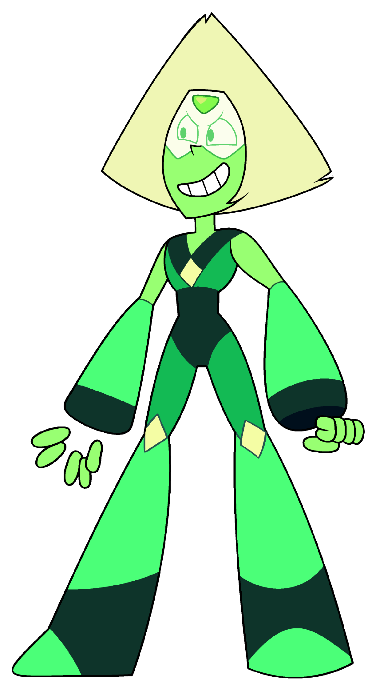
The most unique part about Dr. Ents is her right arm. In her backstory, she lost her original arm as an intern for the laboratory. Wanting to avoid a lawsuit, they immediately gave her an experimental prosthetic arm, and gave her a "PhD" (It was fake. They're a fraud lab). The arm is based more on science-fiction technology as opposed to real life prosthetics. Ents' arm is made using parts that don't physically touch, but instead float. While there's a little bit of Mag-Lev technology inspiration, it's mostly taking influence from fictional technologies like the Iron Man tech or Peridot's limb enhancers from Steven Universe.
(Peridot with her limb enhancers; both her and Dr. Ents have robotic forearms with floating fingers. However, Peridot's don't extend the whole way up her arm, and only involves floating elements with the fingers. - credit: Cartoon Network)
The shape theory I tried to apply to Dr. Ents is squares; the head, the boots, body shape... it's all meant to represent safety. Dr. Ents isn't like the other scientists in her lab. Where they are all cruel and without empathy, she has a sense of humanity. She wants to protect the innocent people in the lab, so no-one ends up like her.
The colours are meant to represent a more positive, less malicious scientist in her lab's wave of dull, "evil" scientists. The lime green shirt and blue jeans stand out more than what her other coworkers would wear. There's also some light blue elements on her as well, but it's exclusively in her technological elements; her arm. This, again, takes inspiration from Iron Man's fictional ARC technology.


NAME: Experimental Item "E.I." #112
AGE: 200 (as crystal chipping), 5 (since consciousness)
SPECIES: Unknown
PROFESSION: none
E.I. #112 (referring to as #112 from here) is meant to be a conscious chip from the twin crystal that fell to Earth with C2's crystal, which came to life but perished after around 1800 years. However, a chip found of the original crystal was found by the lab holding C2 (albeit 3 years earlier), and grew into a tiny version of the original Cuprite.
#112 is meant to be a Jiminy Cricket-esque character, bouncing off of C2. Despite his smaller stature and more immature personality, #112 is older than C2, and acts as their guide to the real world. #112 is street smart, and helps point C2 in the right direction. Bringing back the Jiminy Cricket comparison, he's like a conscious.
The shapes used on #112 are meant to be somewhat simplified versions of C2's; rounded edges, abstracted elements, and so on. The head spikes C2 has are rounded bumps for #112, the arms & legs are more like sticks & stumps respectively, and only having one eye as opposed to C2's pair.
The colours are meant to be somewhat similar to C2, but also noticeably different. They're both red, but with different secondary colours mixed in there too. C2 has more black / purple mixed into it's red, but #112 has a hint of magenta instead. This is to help establish their relationship somewhat. They're both of the same species, even considered relatives; but they're absolutely NOT the same crystal.

NAME: Antibody (translated from ancient language)
AGE: Seconds younger than time itself
SPECIES: unknown
PROFESSION: Silent assassin, hunter
Antibody is a genderless (uncoded) creature, who acts as the antagonist and as a foil to C2.
Antibody is the self proclaimed "second oldest being", a true statement pertaining to being older than everything except existence. It claims to it's victims to be sent by the universe to bring them to a peaceful place, in an attempt to get it's prey easily. It's lie about the universe is a cover up for it's sporting habit: hunting down everything that isn't meant to be there, and eradicating it. It does it for both sport and for personal reasons; purity. Antibody has the world view that everything is designed one way, and that way only; your own species only belongs with your own species. Anything unusual or out of place is removed... by force.
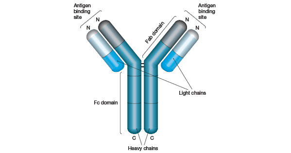
Antibody is based on the real biological antibody protein. Antibodies are designed to immobilise unwanted pathogens, trapping them into submission and eventually destroying them. Through this process, the body then learns how to quickly and efficiently remove similar pathogens. This can be tied to Antibody's goal of irradicating the "unwanted" from the larger body of the universe.

The colours are meant to represent a more positive, less malicious scientist in her lab's wave of dull, "evil" scientists. The lime green shirt and blue jeans stand out more than what her other coworkers would wear. There's also some light blue elements on her as well, but it's exclusively in her technological elements; her arm. This, again, takes inspiration from Iron Man's fictional ARC technology.
(Iron Man's Mark 50 armour (Avengers: Infinity War), with blue, light up elements - credit: Marvel Studios)
E.I. #112
NAME: Experimental Item "E.I." #112
AGE: 200 (as crystal chipping), 5 (since consciousness)
SPECIES: Unknown
PROFESSION: none
E.I. #112 (referring to as #112 from here) is meant to be a conscious chip from the twin crystal that fell to Earth with C2's crystal, which came to life but perished after around 1800 years. However, a chip found of the original crystal was found by the lab holding C2 (albeit 3 years earlier), and grew into a tiny version of the original Cuprite.
#112 is meant to be a Jiminy Cricket-esque character, bouncing off of C2. Despite his smaller stature and more immature personality, #112 is older than C2, and acts as their guide to the real world. #112 is street smart, and helps point C2 in the right direction. Bringing back the Jiminy Cricket comparison, he's like a conscious.
The shapes used on #112 are meant to be somewhat simplified versions of C2's; rounded edges, abstracted elements, and so on. The head spikes C2 has are rounded bumps for #112, the arms & legs are more like sticks & stumps respectively, and only having one eye as opposed to C2's pair.
The colours are meant to be somewhat similar to C2, but also noticeably different. They're both red, but with different secondary colours mixed in there too. C2 has more black / purple mixed into it's red, but #112 has a hint of magenta instead. This is to help establish their relationship somewhat. They're both of the same species, even considered relatives; but they're absolutely NOT the same crystal.
Antibody

NAME: Antibody (translated from ancient language)
AGE: Seconds younger than time itself
SPECIES: unknown
PROFESSION: Silent assassin, hunter
Antibody is a genderless (uncoded) creature, who acts as the antagonist and as a foil to C2.
Antibody is the self proclaimed "second oldest being", a true statement pertaining to being older than everything except existence. It claims to it's victims to be sent by the universe to bring them to a peaceful place, in an attempt to get it's prey easily. It's lie about the universe is a cover up for it's sporting habit: hunting down everything that isn't meant to be there, and eradicating it. It does it for both sport and for personal reasons; purity. Antibody has the world view that everything is designed one way, and that way only; your own species only belongs with your own species. Anything unusual or out of place is removed... by force.
Antibody is based on the real biological antibody protein. Antibodies are designed to immobilise unwanted pathogens, trapping them into submission and eventually destroying them. Through this process, the body then learns how to quickly and efficiently remove similar pathogens. This can be tied to Antibody's goal of irradicating the "unwanted" from the larger body of the universe.
(Representation of an antibody - credit: bio-rad-antibodies.com)
Antibody is also a literal name; just like C2, Antibody is amorphous. So by that, it has no definitive form, or body. This time though, Antibody can create new material for it's body. It's texture is meant to be somewhat slimey, acting like the symbiote from Spider-Man comics. Antibody also goes through two different stages, when trying to persuade it's victims; stage 1 is the standard form, as seen above. Stage 2 sees a more coiled, snake like body shape, as well as sharpened fingers and the head stripped back to reveal a set of razor sharp teeth. Stage 3, nicknamed "Nightmare Antibody", is a 50ft tall mass of whatever Antibody's made of; a hulking chest, muscled arms, and tentacles & growths coming out of it's back and shoulders. The head stays small, but fluctuates between stage 1 and 2 heads. The final touch is a set of teeth in the chest, acting as the final resort.

The colour theory is a washed out navy and white; I chose these colours because they reminded me of space, the origin of Antibody. Black and white was considered at one point, but then I opted against it, since it made shading look strange. Plus, black and white wasn't visually interesting as opposed to the navy blue and white.
There are some light inspirations from a range of sources, but only some more generic elements; an inky / slimy body texture akin to Venom from 2018's Venom, and a final form like the Shadow Blot from the game Epic Mickey.
Friday, November 2, 2018
CHARACTER DESIGN - PHOTOSHOP FILES
We were in the Media Lab today, in our first session in making our final character design files. The files we have to make are:
(for more info on these, see this post)
This first session was focused on the still image formats; the first 3 bullet points.
The cast lineup was simple enough. I used my sketchbook more than my original line up for reference, since I had been able to fine tune the characters more there, and were a more accurate representation of them. I added some shading in the way I'd usually do it; making a multiply layer between the lineart and colour layers, and then doing block shading. I feel the block shading fits my art style much better than more realistic, blurred shading.

The model sheet was where I brought the A3 sheet back. Where the sketchbook had better front views of my characters, they didn't really have fleshed out side and back views. But with C2 (my chosen character), it was mostly a matter of changing the size of the forearms and some other small tweaks.

Finally, the design sheet. This was a little more tricky than the pencil sketched one, since we were given prompts; this time, we were on our own. While I struggled for a while trying to figure out what I could do, I realised I could just demonstrate the physics of the character I had come up with. C2 is meant to be amorphous, and be able to control the size and separation of body parts. So using this, I made quite a few of the poses with this in mind. I also kept in a few generic poses, just to demonstrate what C2 would be like when doing more simple actions.

This session was definitely meant to leave us all to our own devices, with everyone just getting on with it, expected to finish the tasks in our own time. I'm certainly very happy with how mine all turned out. They all looked how I wanted, and look a lot better than characters I'd designed in the past because I kept all the new theory I'd learnt in mind when creating this cast. I don't think there was anything I'd change, but I'd like to revisit this cast at some point in the future, when my style and knowledge of character design has improved.
- CAST LINEUP
- CHARACTER MODEL SHEET
- CHARACTER DESIGN SHEET
- ANIMATED WALK CYCLE
- ANIMATED TURNAROUND
(for more info on these, see this post)
This first session was focused on the still image formats; the first 3 bullet points.
The cast lineup was simple enough. I used my sketchbook more than my original line up for reference, since I had been able to fine tune the characters more there, and were a more accurate representation of them. I added some shading in the way I'd usually do it; making a multiply layer between the lineart and colour layers, and then doing block shading. I feel the block shading fits my art style much better than more realistic, blurred shading.

The model sheet was where I brought the A3 sheet back. Where the sketchbook had better front views of my characters, they didn't really have fleshed out side and back views. But with C2 (my chosen character), it was mostly a matter of changing the size of the forearms and some other small tweaks.

Finally, the design sheet. This was a little more tricky than the pencil sketched one, since we were given prompts; this time, we were on our own. While I struggled for a while trying to figure out what I could do, I realised I could just demonstrate the physics of the character I had come up with. C2 is meant to be amorphous, and be able to control the size and separation of body parts. So using this, I made quite a few of the poses with this in mind. I also kept in a few generic poses, just to demonstrate what C2 would be like when doing more simple actions.

This session was definitely meant to leave us all to our own devices, with everyone just getting on with it, expected to finish the tasks in our own time. I'm certainly very happy with how mine all turned out. They all looked how I wanted, and look a lot better than characters I'd designed in the past because I kept all the new theory I'd learnt in mind when creating this cast. I don't think there was anything I'd change, but I'd like to revisit this cast at some point in the future, when my style and knowledge of character design has improved.
Monday, October 29, 2018
CHARACTER DESIGN - OUR CAST
In this session, we started to put down our designs for our individual casts!
There were four tasks for this session, which involved one large sheet, split into 4 parts. Each section focused on an area of the cast design, including:
When moving on to the primary sketches, we were encouraged to show what shapes were underneath clothes and larger appendages. Adding general shapes into the character helps establish space and what certain parts of the character, for lack of a better term, feel like.

We next moved on to the character model sheet; for this, we had to choose ONE character from our cast, with the only rule being they have to be bipedal humanoids. I chose my protagonist, C2 (seen on the far left of my cast lineup). This stage was where I made quite a substantial change to my character design. I made the forearms much bigger, keeping in mind the morse code analogy where keeping the shapes used varied is more interesting and has more rhythm to it. Also, doing this made the arms look less like tubes, and more alien; appropriate for the character.
From there, it was quite a simple road to creating the model sheet. Making a set of guide lines to keep the head, torso and legs to correct scale proved helpful.

Next step was the design sheet, which was the part I enjoyed the most. For this, we were given two types of prompts we had to draw our character around; an scenario or an image. For example, a scenario given was "your character is late for the bus", and we had to draw what that character would look like running to try and catch up to the bus. An image example is this image of Michael Jackson, which we had to replicate with out characters.

We ended up with around 10 drawings each, in a wide range of poses.


And that was it, essentially! In the end, I ended up with a full sheet looking like this:

I'm happy with how the character looks at this point, although some slight adjustments in terms of proportions and particular body parts may change naturally. Our next step is to start bringing these characters and sheets into the digital space, using Photoshop and TVPaint. I'm eager to get started with it!

There were four tasks for this session, which involved one large sheet, split into 4 parts. Each section focused on an area of the cast design, including:
- Cast Lineup - The whole cast standing side by side. Used to show scale in relation to one another, and how the characters look generically.
- Character Model Sheet (Turnaround) - One character as seen from the front, side, back and from a 3/4 view.
(Supergirl's model sheet - credit: Warner Bros.) - Character Design Sheet - One character in a range of different poses, e.g. fighting poses, running, walking, etc.

(Design sheet for various Rainicorns from Adventure Time - credit: Cartoon Network) - Walk Cycle - Showing the way a character walks, usually expressing some kind of personality or emotion
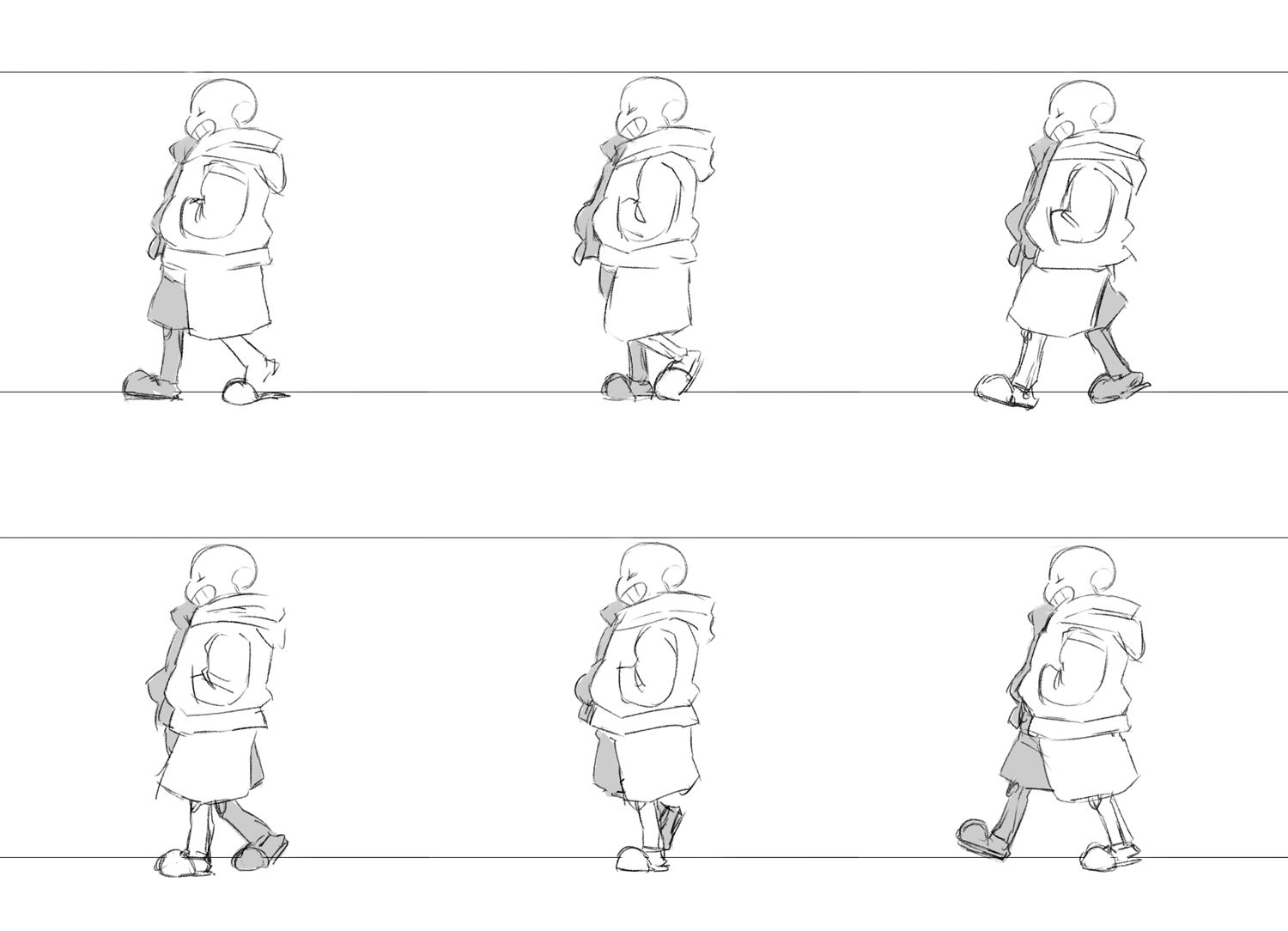
(Fan made walk cycle of Sans from Undertale - credit: Leaphy on Weasyl)

(Cast lineup for SpongeBob SquarePants - credit: Nickelodeon)
When moving on to the primary sketches, we were encouraged to show what shapes were underneath clothes and larger appendages. Adding general shapes into the character helps establish space and what certain parts of the character, for lack of a better term, feel like.

(My cast lineup, both silhouettes and full sketches)
We next moved on to the character model sheet; for this, we had to choose ONE character from our cast, with the only rule being they have to be bipedal humanoids. I chose my protagonist, C2 (seen on the far left of my cast lineup). This stage was where I made quite a substantial change to my character design. I made the forearms much bigger, keeping in mind the morse code analogy where keeping the shapes used varied is more interesting and has more rhythm to it. Also, doing this made the arms look less like tubes, and more alien; appropriate for the character.
From there, it was quite a simple road to creating the model sheet. Making a set of guide lines to keep the head, torso and legs to correct scale proved helpful.

(C2 model sheet)
Next step was the design sheet, which was the part I enjoyed the most. For this, we were given two types of prompts we had to draw our character around; an scenario or an image. For example, a scenario given was "your character is late for the bus", and we had to draw what that character would look like running to try and catch up to the bus. An image example is this image of Michael Jackson, which we had to replicate with out characters.

We ended up with around 10 drawings each, in a wide range of poses.

(C2's design sheet)
Our final task for this session was to make a basic walk cycle for our character. We used the basic guide from The Animator's Survival Kit by Richard Williams as a template of sorts, and then applying small changes to accommodate our characters' needs. I originally went in the direction of having larger steps, to represent the larger stature of the character. I drew that up, and then realised it wouldn't quite simulate the weight I wanted from the character.
(C2's original walk cycle; notes below the cycle are changes to be made.)
And that was it, essentially! In the end, I ended up with a full sheet looking like this:
I'm happy with how the character looks at this point, although some slight adjustments in terms of proportions and particular body parts may change naturally. Our next step is to start bringing these characters and sheets into the digital space, using Photoshop and TVPaint. I'm eager to get started with it!
Friday, October 26, 2018
CHARACTER DESIGN - THE CAST
This session, we looked at how to design a cast. There wasn't very much theory involved, but I'll log what I did write down.
We first did a little warm up, where we had to reboot the popular children's series Teletubbies.
(Teletubbies - credit: BBC)
Our reboot was meant to be aimed at a somewhat older audience, so I decided to aim for the Rick & Morty kind of audience; a bit of dark humour, but also quite down to Earth too. So I decided to go with a reboot I nicknamed "Teletubbies: The Mid-Life Crisis".

After the warm-up, we went through some more principles of character design (for the others, see this post)
We then moved onto more tasks, which was the majority of the rest of the session.
First, we had to take scraps of paper and small coins and make silhouettes out of 3 of them combined. Every time we made one, we'd have to rip the scraps in half, and continue making smaller and smaller silhouettes until we had 10.
Next, we had to turn the sheet around so that someone else had our silhouettes. Using the other person's silhouettes, we had to add on limbs and features. This made the silhouettes more into characters, giving them expressiveness and a little bit of personality.
Our next task involved drawing 10 variations on an exclaimation mark (!). This involved different ways of drawing the line and the dot, making them as varied as possible. Once 10 were drawn, we did the same again as with the silhouettes; turned around the sheet (so we got our original silhouettes), and add limbs & features to the other person's exclaimation marks.
After that, we took some scraps leftover from the silhouette task, glued them down, and made faces out of them. They could be long pieces of paper, squared, weird shaped, whatever there was... make a face out of it.
Our final "prep" task was to look into our sketchbook, at our observational drawings, and make characters out of some of the objects we drew. The ones I'm happiest with are the microphone character and the CCTV camera character, adapted into a stout, coat wearing man and a curious robot, respectively.
Now, onto the main task. In groups of 4-5, we had to create a cast using any of the characters created prior on the large sheet. They should've fit into the archetypes hero, villain, mentor, ally and trickster / shapeshifter. Not just that, we had to come up with a name for the figurative show, an ideal audience, and character names.
I was in charge of designing the villain. I chose a silhouette which was originally quite stout, but used a lot of triangles and angles; traditionally antagonistic shapes. Our "show"'s concept involved characters from different time periods, so the villain I designed was meant to be from the future. They're like a robotic overlord, who has no real identity. I named them Karnaak, a somewhat villainous name.
We named the show "Out of Time", in allusion to the concept of characters being from different time periods. We aimed at a early teens to early 20s age group; something similar to Rick & Morty or Gravity Falls. The other characters we had were Henry (hero), Bill (mentor), Alex (trickster), and Fibbage (ally).

In the end our sheet looked like this:

Overall, I'm really happy with this session! This was our first real journey to letting our individual imaginations and styles loose onto characters, and I was excited to bring my ideas to the table! Working with other people was also beneficial, and the input from others definitely helped with the designs I did.
I'm looking forward to more!
We first did a little warm up, where we had to reboot the popular children's series Teletubbies.
Our reboot was meant to be aimed at a somewhat older audience, so I decided to aim for the Rick & Morty kind of audience; a bit of dark humour, but also quite down to Earth too. So I decided to go with a reboot I nicknamed "Teletubbies: The Mid-Life Crisis".

(see bottom left corner)
- Visual Rythm - "Think of it like morse code. Maintain variety, harmony & rhythm, and you'll be saying something." Essentially, keep variety and you'll have a more interesting looking character. Don't design someone completely flat, or only using the same shapes over and over again.
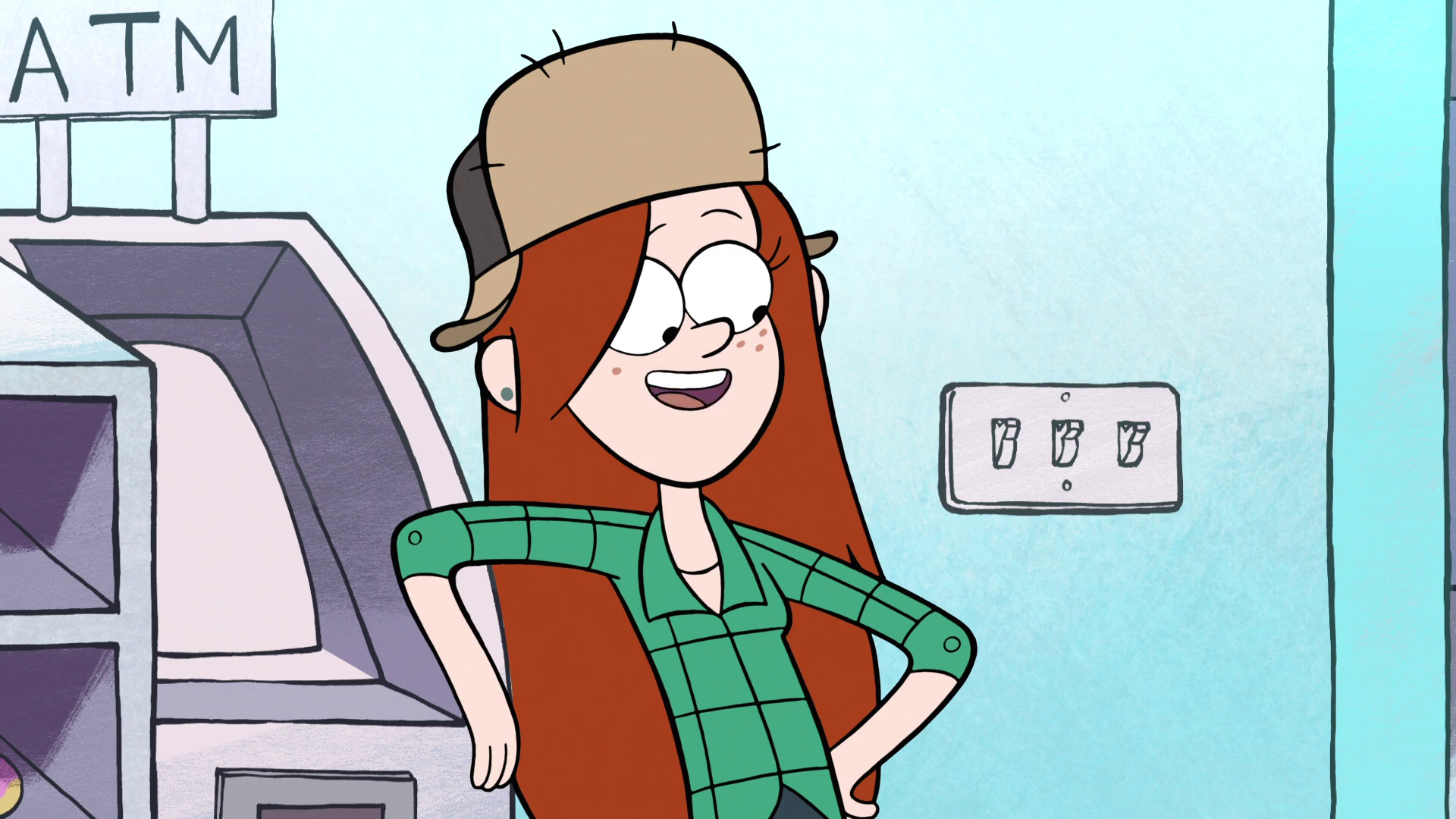
(Wendy Corduroy from Gravity Falls is made up of a variety of shapes and edges, none of which are used in excess or in great volumes with each other - credit: Disney Television Animation) - Caricature - Playing up the unique features and specialties of a character, and playing down what isn't special. Mostly used in comedy to ridicule people / groups.
 (In Family Guy, the design for celebrity John Goodman plays on his larger figure to an extreme, making him cartoonishly overweight - credit: 20th Century Fox)
 - Personification - The representation of an abstract quality or idea in human / anthropomorphised form. Common examples are emotions and personality traits.(Kronk from The Emperor's New Groove has infrequent visits from an angel & devil on his shoulders, both resembling him physically. As expected, the angel represents good and the devil represents bad - credit: Walt Disney Studios)
- Anthropomorphism - giving non-humans human qualities. For a more in depth look at the concept, see this post.(In the Cars universe, cars are assigned human qualities, both physically and emotionally. This scene shows Lightning McQueen at a bar, with a selection of other cars, as they reminisce. credit: Pixar Animation Studios)
- Pareidolia - Seeing patterns in random data / stimuli. Usually faces or human figures.
 (Godzilla in the clouds? credit: Cape Ann Images, Pain Science)
We then moved onto more tasks, which was the majority of the rest of the session.
First, we had to take scraps of paper and small coins and make silhouettes out of 3 of them combined. Every time we made one, we'd have to rip the scraps in half, and continue making smaller and smaller silhouettes until we had 10.
Next, we had to turn the sheet around so that someone else had our silhouettes. Using the other person's silhouettes, we had to add on limbs and features. This made the silhouettes more into characters, giving them expressiveness and a little bit of personality.
Our next task involved drawing 10 variations on an exclaimation mark (!). This involved different ways of drawing the line and the dot, making them as varied as possible. Once 10 were drawn, we did the same again as with the silhouettes; turned around the sheet (so we got our original silhouettes), and add limbs & features to the other person's exclaimation marks.
After that, we took some scraps leftover from the silhouette task, glued them down, and made faces out of them. They could be long pieces of paper, squared, weird shaped, whatever there was... make a face out of it.
Our final "prep" task was to look into our sketchbook, at our observational drawings, and make characters out of some of the objects we drew. The ones I'm happiest with are the microphone character and the CCTV camera character, adapted into a stout, coat wearing man and a curious robot, respectively.
Now, onto the main task. In groups of 4-5, we had to create a cast using any of the characters created prior on the large sheet. They should've fit into the archetypes hero, villain, mentor, ally and trickster / shapeshifter. Not just that, we had to come up with a name for the figurative show, an ideal audience, and character names.
I was in charge of designing the villain. I chose a silhouette which was originally quite stout, but used a lot of triangles and angles; traditionally antagonistic shapes. Our "show"'s concept involved characters from different time periods, so the villain I designed was meant to be from the future. They're like a robotic overlord, who has no real identity. I named them Karnaak, a somewhat villainous name.
We named the show "Out of Time", in allusion to the concept of characters being from different time periods. We aimed at a early teens to early 20s age group; something similar to Rick & Morty or Gravity Falls. The other characters we had were Henry (hero), Bill (mentor), Alex (trickster), and Fibbage (ally).

In the end our sheet looked like this:

Overall, I'm really happy with this session! This was our first real journey to letting our individual imaginations and styles loose onto characters, and I was excited to bring my ideas to the table! Working with other people was also beneficial, and the input from others definitely helped with the designs I did.
I'm looking forward to more!
Monday, October 22, 2018
CHARACTER DESIGN - INTRODUCTION
This session introduced us to the character design project!
We had Jon as our lecturer for this session, and we'll have him for all future character design sessions. We started out with some sheets of paper. Surrounding a blank circular area in the middle were some black rectangles, triangles and circles. And yet around THOSE shapes were some miscellaneous ink / paint splatters in various pastel colours.
We were first tasked with seeing how well we could remember how certain characters looked by drawing them from memory; these included Mickey Mouse, SpongeBob SquarePants, Snoopy, Moomin and Mario.
After the brief exercise, we were told to try and find shapes and characters with some of the ink blots. We could make them as large or as little as we liked, with any kind of details we wanted.

After about 10 minutes, we finished up with that and moved further into the middle, looking at the shapes.
Before we got to do anything with them, we had a look at shape theory. Shape theory is essentially what shape conveys to an audience, mostly about what a character is like. Typically there are three main shapes:
Combining shapes and highlighting specific ones make a character's personality and sometimes archetype stand out more, especially when reduced to just a silhouette.
Using the shapes, we were encouraged to make just those: character silhouettes. Not for characters that exist already, but for whole new ones. We did this for about 10 - 15 minutes, and I was trying to find characters that'd both feel like something I'd make, but also seem very unusual and weird. I found a couple of characters I really liked, including one with coils for limbs, a bird thing, a robot and an evil Shakespearean snowman.
We were asked to choose one character from our silhouettes, and draw how they'd look regularly in the blank circle in the middle. I opted for the bird thing, both out of necessity for a smaller character, and because it hits the sweet spot of being both weird and normal for me.

I nicknamed it "Fletchling", but that didn't matter at that point... because we were going to interpret everyone else's characters! By this, it meant putting everyone's characters onto the screen one by one, and then getting 2 minutes to draw them in our own way, using different markmaking tools each time. We ended up doing this for around 40 minutes, and it was really interesting seeing what everyone came up with!
At the end, we cut all the characters out and gave them to whoever drew the original. I managed to amass a collection of interesting looking Fletchlings, as seen here by a few of them!

And in the end, I had a sheet that looked like this!

This session was about learning the process of character design; the absolute basics. I thought it was a lot of fun, and didn't really have any issues with anything! I'm really looking forward to more character designing, especially since that's my favourite part of the animation process! Overall, a successful character design introduction!
We had Jon as our lecturer for this session, and we'll have him for all future character design sessions. We started out with some sheets of paper. Surrounding a blank circular area in the middle were some black rectangles, triangles and circles. And yet around THOSE shapes were some miscellaneous ink / paint splatters in various pastel colours.
We were first tasked with seeing how well we could remember how certain characters looked by drawing them from memory; these included Mickey Mouse, SpongeBob SquarePants, Snoopy, Moomin and Mario.
After the brief exercise, we were told to try and find shapes and characters with some of the ink blots. We could make them as large or as little as we liked, with any kind of details we wanted.

After about 10 minutes, we finished up with that and moved further into the middle, looking at the shapes.
Before we got to do anything with them, we had a look at shape theory. Shape theory is essentially what shape conveys to an audience, mostly about what a character is like. Typically there are three main shapes:
- CIRCLE - Cute, friendly, peaceful (e.g. Po from Kung-Fu Panda)
- SQUARE - Stable, solid (e.g. Superman from Justice League: The Animated Series)
- TRIANGLE - Dynamic, angular, somewhat evil (e.g. Jafar from Aladdin)
Combining shapes and highlighting specific ones make a character's personality and sometimes archetype stand out more, especially when reduced to just a silhouette.
Using the shapes, we were encouraged to make just those: character silhouettes. Not for characters that exist already, but for whole new ones. We did this for about 10 - 15 minutes, and I was trying to find characters that'd both feel like something I'd make, but also seem very unusual and weird. I found a couple of characters I really liked, including one with coils for limbs, a bird thing, a robot and an evil Shakespearean snowman.
We were asked to choose one character from our silhouettes, and draw how they'd look regularly in the blank circle in the middle. I opted for the bird thing, both out of necessity for a smaller character, and because it hits the sweet spot of being both weird and normal for me.

I nicknamed it "Fletchling", but that didn't matter at that point... because we were going to interpret everyone else's characters! By this, it meant putting everyone's characters onto the screen one by one, and then getting 2 minutes to draw them in our own way, using different markmaking tools each time. We ended up doing this for around 40 minutes, and it was really interesting seeing what everyone came up with!
At the end, we cut all the characters out and gave them to whoever drew the original. I managed to amass a collection of interesting looking Fletchlings, as seen here by a few of them!

And in the end, I had a sheet that looked like this!

This session was about learning the process of character design; the absolute basics. I thought it was a lot of fun, and didn't really have any issues with anything! I'm really looking forward to more character designing, especially since that's my favourite part of the animation process! Overall, a successful character design introduction!
Sunday, October 21, 2018
CHARACTER DESIGN - BRIEF AND CAST ANALYSIS
In this session, we started our Character Design unit. The brief of the entire unit is easily broken into two main goals;
The unit will focus on creating characters in a 2D landscape, but the same basic principles can be applied to 3D and Stop-Motion as well.
When we reach submission day on the 16th of November, we'll need to hand in:
We can choose how the characters look, in terms of style, but if we take influence from other's styles (e.g. Pendleton Ward's Adventure Time's style), then we should do well-informed research on it.
We were told there are 7 principles to character design:
CAST 1: Gravity Falls

The main cast of Gravity Falls is, from left to right, Soos, Dipper, "Grunkle" Stan, Mabel and Wendy.
Immediately, we can see shape theory in play. Soos is primarily made up of circles and rounded edges. From this, we can safely assume that he's meant to be a friendly, caring, safe character. This is correct, as we see in episodes like Soos and the Real Girl and Blendin's Game. Twins Dipper and Mabel Pines both use round shapes, yet Dipper also has some square elements to him. Using this, we can guess both twins are friendly and safe, but Dipper has a more stable element to him. This, again, is true, as seen in Dipper and Mabel vs The Future and Carpet Diem. Grunkle Stan is an example of subversive shape design. He's made up of mostly square shapes, suggesting a more solid, stable figure. However, the show goes out of it's way to show Stan's recklessness, and later on in episodes like Not What He Sees, how trust in him should be questioned. Finally, Wendy uses more triangles than any other protagonist on the show. While she's not got the evil factor that triangles are associated with, she definitely acts a lot more dynamically. In episodes like Weirdmageddon Part 2 and Into The Bunker, she's an athletic, fast-on-her-feet independent.
The silhouettes of the characters are somewhat recognisable, mostly through specific features. Dipper and Mabel, to the untrained eye, would seem almost indistinguishable from each other in silhouette form. However, Dipper wears a large baseball cap, and Mabel has much longer hair and a skirt. Not to mention, Dipper's cap is his most defining detail; Bill Cipher, the show's antagonist, nicknames him Pine Tree because of it. Soos' larger figure and unique head shape make him more recognisable from the other silhouettes, not to mention his leg to body proportions. Stan's broad shoulders, thin legs and fez all contribute towards his silhouette, in order to make him arguably the most recognisable character. Finally, Wendy is probably the least recognisable. Her proportions are somewhat "normal", and fits in with the background characters. Her boots could be a giveaway though; most Gravity Falls extras have legs that fit snugly into their shoes, where Wendy has a lot of room left.
The only asymmetrical elements of characters come from clothes or accessories. Where Dipper and Wendy only have asymmetry in hair flicks, Soos, Mabel and Stan have more noticable asymmetrical details. Stan's fez has a fish(?) design on it, which would flip directions if Stan was fully mirrored. The same can be said for Soos' question mark and Mabel's shooting star, seen on their torso. Plus, Stan is often seen with his 8-Ball cane, which contributes to giving him a more unbalanced look.
CAST 2: Eddsworld
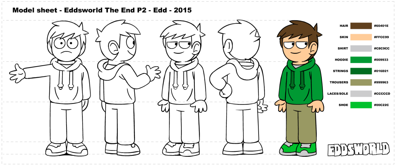
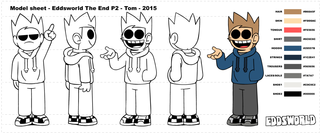

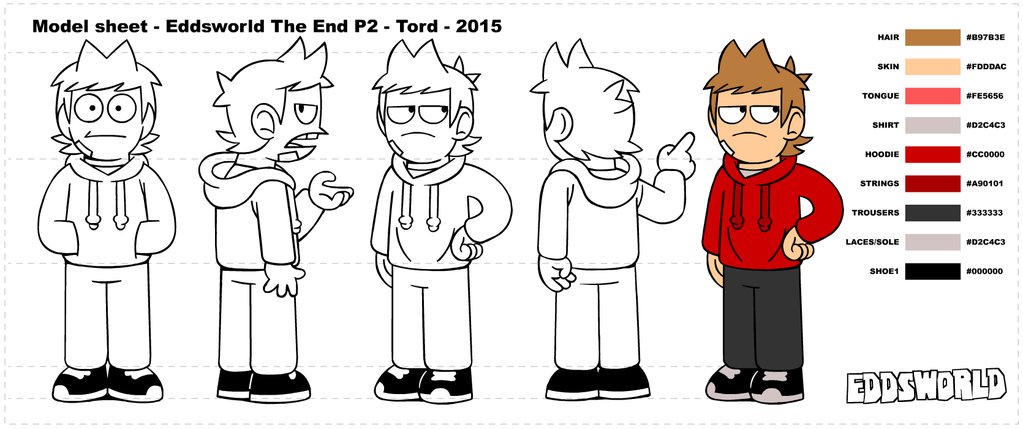
Eddsworld main casts, from top to bottom, comprises of Edd, Tom, Matt and Tord.
Despite the original character designs coming from a teenage Edd Gould, we can still see some light elements of shape theory. While all the characters have hair spikes, two characters have an added roundness to theirs; Edd and Tord. Interestingly, this can be seen in different ways for different characters. Edd is the nice guy, he wants to have fun, and is completely carefree. However, he can tend to be reckless sometimes, given the dulled down spike. This shows a more carefree, innocent character with a little bit of edge to them, but not too much. Tord, on the other hand, has the inverse of Edd's hair. It's mostly spike, with a little bit of roundness leading up to it. The design could be a subversive one, given his development from pretending to be friends with everyone to being an enemy. He goes from rounded ally to spiked enemy.
The hair plays a key role in their silhouettes as well. All 4 of the characters wear identical clothes, just with different colourations, so it's up to their natural features to dictate their silhouettes' impact. Edd, Matt, Tom and Tord all have vastly different hair shapes, ranging from flattened, short hair to tall, huge spiked hair. However, the heads themselves also help. They all have some unique aspect to their head shapes too; Matt has a squared jaw, Edd's head is smaller than everyone elses, etc.
Once again, their hairshapes define another attribute of the characters; their asymmetry. Looking at the characters, their hair all seems to lean somewhat. It could be leaning back like Tord's, or forward like Tom's, even when looking at the characters dead on. This helps to give them a more natural feel, and not like they were designed by a machine.
CAST 3: The Legend of Zelda: Majora's Mask
- Engage in the character design process
- Bring one character to life in a walk cycle.
The unit will focus on creating characters in a 2D landscape, but the same basic principles can be applied to 3D and Stop-Motion as well.
When we reach submission day on the 16th of November, we'll need to hand in:
- A Cast Model Sheet - 4 to 10 characters on one design sheet
- A Character Model Sheet - taking one of the characters from the cast and showing the fundamentals of their design
- Character Design Sheet - showing the final character design in a range of poses and under different circumstances
- Animated Turnaround - a 360 degree look at the character, which spins around.
- Animated Walk Cycle - a shot of the character walking on the spot, showcasing how they'd usually walk and how their personality can be expressed through that
We can choose how the characters look, in terms of style, but if we take influence from other's styles (e.g. Pendleton Ward's Adventure Time's style), then we should do well-informed research on it.
We were told there are 7 principles to character design:
- Research - If the character is based on something, how accurately does it portray that thing? For example, if a character comes from Asia, they shouldn't follow Western practices out of habit.
- Shape Language - Also known as shape theory, this suggests that three main shapes portray different moods and characteristics to an audience. Depending on which shapes build a character, the audience will assume differently of them. Usually, the three shapes are circle (represents peace, cuteness, friendliness), square (solid, stable, reliable) and triangle (angular, dynamic, somewhat evil). Characters can also use subversive shapes; for example, an evil character could be made of all circles.
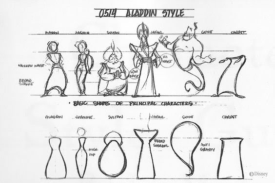 (Aladdin character designs and corresponding shapes - credit: Walt Disney Animation)
 - Silhouette - The design has to be unique and recognisable enough so that if you were just seeing a silhouette of them, you'd still be able to tell who they are. They need to demonstrate clarity and appeal.
 (Various Cartoon Character Silhouettes - image credit: Sporcle)
 - Asymmetry - Making sure the character doesn't look exactly the same on both sides of their body. This leads to blander, less appealing designs. Usually, asymmetry is utilised via the hair or face. Asymmetry can also come from unique poses, and avoiding always having a front on pose.
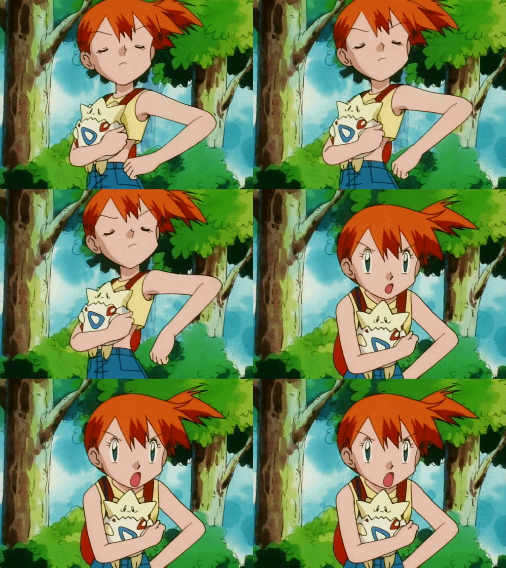 (Misty from the Pokemon anime is an asymmetrical character; her hairstyle throws her symmetry off - credit: Nintendo, 4Kids)
 - Abstraction - How simple can you break the character down to be? Will it's base components give enough of an idea of who they are?
- Appeal - The character should be interesting to look at, be it through simple design choices (shapes, colours, style), or depending on their design complexity (antagonists usually more detailed, protagonists more simple)
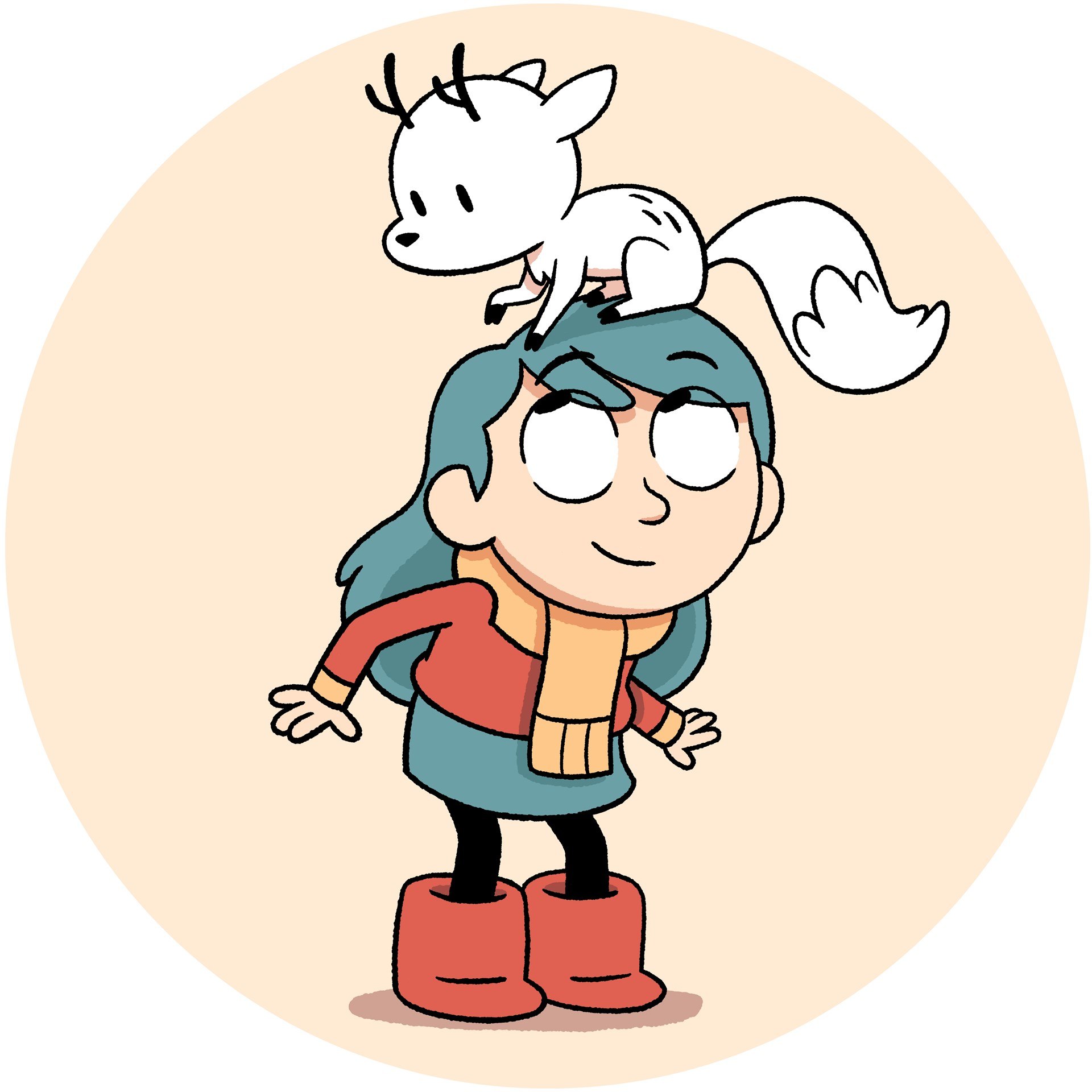
(Most of the designs in Hilda have a bouncy, round look to them, making them nicer to look at - credit: Netflix) - Movement - How the character moves should tell us something about them. How they usually feel, their weight, etc. A standard walk cycle can make a character seem dull, so a more animated walk cycle, full of personality, helps communicate more about them.
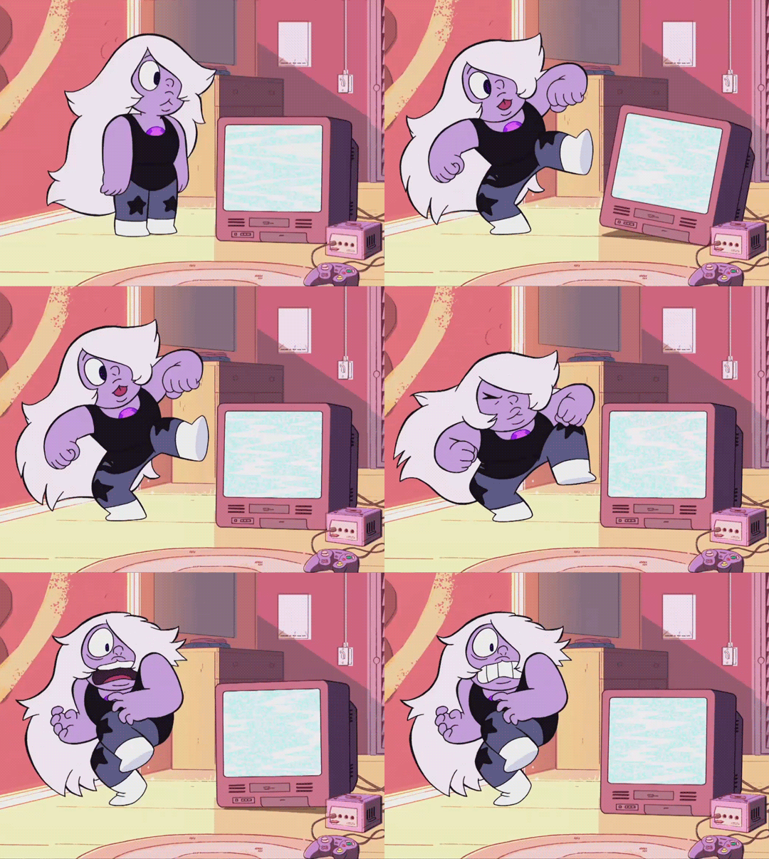
(Amethyst from Steven Universe moves and act much like a child would in this scene, hinting at her more immature, reckless behaviour - credit: Cartoon Network)
(Inside Out shows 4 steps of abstraction, albeit in reverse - credit: Pixar Animation Studios)
CAST 1: Gravity Falls
(The main cast of Gravity Falls - credit: Disney Television Animation)
Immediately, we can see shape theory in play. Soos is primarily made up of circles and rounded edges. From this, we can safely assume that he's meant to be a friendly, caring, safe character. This is correct, as we see in episodes like Soos and the Real Girl and Blendin's Game. Twins Dipper and Mabel Pines both use round shapes, yet Dipper also has some square elements to him. Using this, we can guess both twins are friendly and safe, but Dipper has a more stable element to him. This, again, is true, as seen in Dipper and Mabel vs The Future and Carpet Diem. Grunkle Stan is an example of subversive shape design. He's made up of mostly square shapes, suggesting a more solid, stable figure. However, the show goes out of it's way to show Stan's recklessness, and later on in episodes like Not What He Sees, how trust in him should be questioned. Finally, Wendy uses more triangles than any other protagonist on the show. While she's not got the evil factor that triangles are associated with, she definitely acts a lot more dynamically. In episodes like Weirdmageddon Part 2 and Into The Bunker, she's an athletic, fast-on-her-feet independent.
The silhouettes of the characters are somewhat recognisable, mostly through specific features. Dipper and Mabel, to the untrained eye, would seem almost indistinguishable from each other in silhouette form. However, Dipper wears a large baseball cap, and Mabel has much longer hair and a skirt. Not to mention, Dipper's cap is his most defining detail; Bill Cipher, the show's antagonist, nicknames him Pine Tree because of it. Soos' larger figure and unique head shape make him more recognisable from the other silhouettes, not to mention his leg to body proportions. Stan's broad shoulders, thin legs and fez all contribute towards his silhouette, in order to make him arguably the most recognisable character. Finally, Wendy is probably the least recognisable. Her proportions are somewhat "normal", and fits in with the background characters. Her boots could be a giveaway though; most Gravity Falls extras have legs that fit snugly into their shoes, where Wendy has a lot of room left.
The only asymmetrical elements of characters come from clothes or accessories. Where Dipper and Wendy only have asymmetry in hair flicks, Soos, Mabel and Stan have more noticable asymmetrical details. Stan's fez has a fish(?) design on it, which would flip directions if Stan was fully mirrored. The same can be said for Soos' question mark and Mabel's shooting star, seen on their torso. Plus, Stan is often seen with his 8-Ball cane, which contributes to giving him a more unbalanced look.
CAST 2: Eddsworld
(Individual character sheets for the main characters, created for "Eddsworld: The End" - credit: Paul ter Voorde, Thomas "TomSka" Ridgewell)
Eddsworld main casts, from top to bottom, comprises of Edd, Tom, Matt and Tord.
Despite the original character designs coming from a teenage Edd Gould, we can still see some light elements of shape theory. While all the characters have hair spikes, two characters have an added roundness to theirs; Edd and Tord. Interestingly, this can be seen in different ways for different characters. Edd is the nice guy, he wants to have fun, and is completely carefree. However, he can tend to be reckless sometimes, given the dulled down spike. This shows a more carefree, innocent character with a little bit of edge to them, but not too much. Tord, on the other hand, has the inverse of Edd's hair. It's mostly spike, with a little bit of roundness leading up to it. The design could be a subversive one, given his development from pretending to be friends with everyone to being an enemy. He goes from rounded ally to spiked enemy.
The hair plays a key role in their silhouettes as well. All 4 of the characters wear identical clothes, just with different colourations, so it's up to their natural features to dictate their silhouettes' impact. Edd, Matt, Tom and Tord all have vastly different hair shapes, ranging from flattened, short hair to tall, huge spiked hair. However, the heads themselves also help. They all have some unique aspect to their head shapes too; Matt has a squared jaw, Edd's head is smaller than everyone elses, etc.
Once again, their hairshapes define another attribute of the characters; their asymmetry. Looking at the characters, their hair all seems to lean somewhat. It could be leaning back like Tord's, or forward like Tom's, even when looking at the characters dead on. This helps to give them a more natural feel, and not like they were designed by a machine.
CAST 3: The Legend of Zelda: Majora's Mask
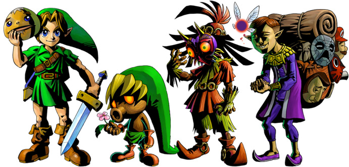
(Link, Deku Link, Skull Kid, Tatl and Mask Salesman - credit: Nintendo)
Majora's Mask consists of 4 main characters: Link, Skull Kid, Tatl and the Mask Salesman. However, Link gets three extra looks to him using transformative masks, being Deku Link (pictured), Goron Link and Zora Link.
Link's shape theory varies from form to form. In his regular human form, he's mostly shown to be made up of squares and triangles. While not evil, this shows his dynamic side, given his athleticism. The squares also represent his stability and sturdiness; appropriate for the "hero of the land". Deku Link and Goron Link both soley use circular shapes; Deku uses it for the cute factor, and Goron uses it for the safety factor (the ability Goron Link gets is increased defence). Zora Link's shapes are influenced by his abilities too; he's mostly made up of triangles. Tatl is made of just one circle. This is another subversive design; Tatl is meant to be a fairy, who help out the Kokiri people like Link. Tatl isn't helpful, and is downright rude most of the time. Skull Kid is an interesting design; where a lot of the base body uses squares, the Mask they wear is made up of many triangles. This can be read as representing what actually happened to Skull Kid; before the mask, he was living feral in the forest with Tatl and Tael (another fairy). However, after finding Majora's Mask, he became corrupted and evil. The Mask's spikes and triangles may resemble this. Finally, the Mask Salesman. His bag contains mostly circles, leading the audience to think that what he's selling is safe and this guy could be friendly. However, the triangular angles on the actual character suggest otherwise; his pointed shoes, his ears, even his facial features are noticeably more angular than other characters.
Their silhouettes are very recognisable through several features. Link has his long, green hat, a sword & a shield, Skull Kid has the flares all over his clothes, plus the spiked Majora's Mask, Tatl could be considered a silhouette already, and the backpack & hunch of the Mask Salesman gives him away. The alternate versions of Link are somewhat more tricky to identify. When Link transforms, he becomes one of the species he's got the mask of. However, this means that his silhouette is identical. Someone could easily mistake Goron Link for just a Goron.
The characters also have some asymmetrical attributes too. Link has a sword and a shield in each hand, as well as a belt strapped around his shoulder. His hat also tends to droop to one side, instead of falling flat onto his back. Skull Kid has his flares somewhat asymmetrical, given that there's no exact pattern or structure to them. The Salesman has his masks on his backpack to give him the sense of asymmetry, with nothing else giving him that. The other 3 Links and Tatl have no defining features to show any kind of asymmetry.
Overall, I'd say this was a good introduction to the unit! I'm really excited to start out, especially since I've been designing characters myself for so long, and now I'm going to be able to learn how to make better ones!
Subscribe to:
Posts (Atom)