We first did a little warm up, where we had to reboot the popular children's series Teletubbies.
Our reboot was meant to be aimed at a somewhat older audience, so I decided to aim for the Rick & Morty kind of audience; a bit of dark humour, but also quite down to Earth too. So I decided to go with a reboot I nicknamed "Teletubbies: The Mid-Life Crisis".

(see bottom left corner)
- Visual Rythm - "Think of it like morse code. Maintain variety, harmony & rhythm, and you'll be saying something." Essentially, keep variety and you'll have a more interesting looking character. Don't design someone completely flat, or only using the same shapes over and over again.
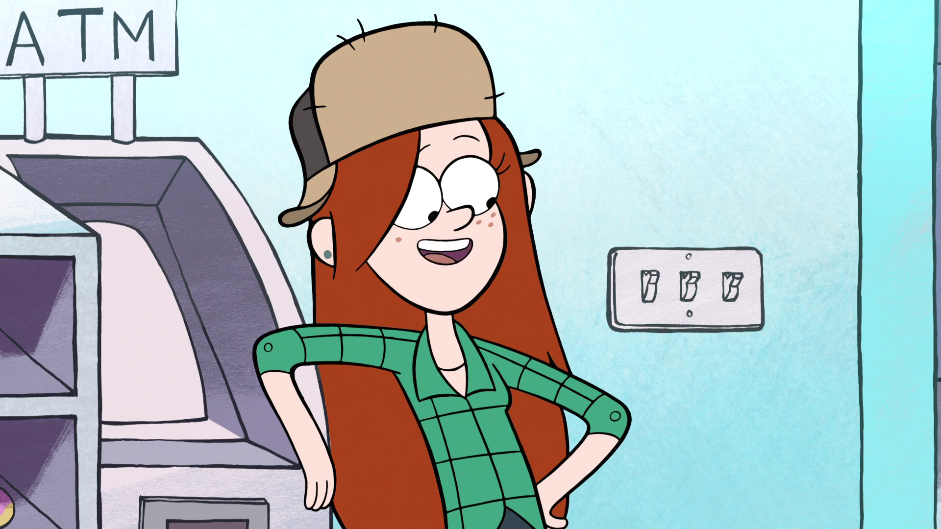
(Wendy Corduroy from Gravity Falls is made up of a variety of shapes and edges, none of which are used in excess or in great volumes with each other - credit: Disney Television Animation) - Caricature - Playing up the unique features and specialties of a character, and playing down what isn't special. Mostly used in comedy to ridicule people / groups.
 (In Family Guy, the design for celebrity John Goodman plays on his larger figure to an extreme, making him cartoonishly overweight - credit: 20th Century Fox)
 - Personification - The representation of an abstract quality or idea in human / anthropomorphised form. Common examples are emotions and personality traits.(Kronk from The Emperor's New Groove has infrequent visits from an angel & devil on his shoulders, both resembling him physically. As expected, the angel represents good and the devil represents bad - credit: Walt Disney Studios)
- Anthropomorphism - giving non-humans human qualities. For a more in depth look at the concept, see this post.(In the Cars universe, cars are assigned human qualities, both physically and emotionally. This scene shows Lightning McQueen at a bar, with a selection of other cars, as they reminisce. credit: Pixar Animation Studios)
- Pareidolia - Seeing patterns in random data / stimuli. Usually faces or human figures.
 (Godzilla in the clouds? credit: Cape Ann Images, Pain Science)
We then moved onto more tasks, which was the majority of the rest of the session.
First, we had to take scraps of paper and small coins and make silhouettes out of 3 of them combined. Every time we made one, we'd have to rip the scraps in half, and continue making smaller and smaller silhouettes until we had 10.
Next, we had to turn the sheet around so that someone else had our silhouettes. Using the other person's silhouettes, we had to add on limbs and features. This made the silhouettes more into characters, giving them expressiveness and a little bit of personality.
Our next task involved drawing 10 variations on an exclaimation mark (!). This involved different ways of drawing the line and the dot, making them as varied as possible. Once 10 were drawn, we did the same again as with the silhouettes; turned around the sheet (so we got our original silhouettes), and add limbs & features to the other person's exclaimation marks.
After that, we took some scraps leftover from the silhouette task, glued them down, and made faces out of them. They could be long pieces of paper, squared, weird shaped, whatever there was... make a face out of it.
Our final "prep" task was to look into our sketchbook, at our observational drawings, and make characters out of some of the objects we drew. The ones I'm happiest with are the microphone character and the CCTV camera character, adapted into a stout, coat wearing man and a curious robot, respectively.
Now, onto the main task. In groups of 4-5, we had to create a cast using any of the characters created prior on the large sheet. They should've fit into the archetypes hero, villain, mentor, ally and trickster / shapeshifter. Not just that, we had to come up with a name for the figurative show, an ideal audience, and character names.
I was in charge of designing the villain. I chose a silhouette which was originally quite stout, but used a lot of triangles and angles; traditionally antagonistic shapes. Our "show"'s concept involved characters from different time periods, so the villain I designed was meant to be from the future. They're like a robotic overlord, who has no real identity. I named them Karnaak, a somewhat villainous name.
We named the show "Out of Time", in allusion to the concept of characters being from different time periods. We aimed at a early teens to early 20s age group; something similar to Rick & Morty or Gravity Falls. The other characters we had were Henry (hero), Bill (mentor), Alex (trickster), and Fibbage (ally).

In the end our sheet looked like this:

Overall, I'm really happy with this session! This was our first real journey to letting our individual imaginations and styles loose onto characters, and I was excited to bring my ideas to the table! Working with other people was also beneficial, and the input from others definitely helped with the designs I did.
I'm looking forward to more!
No comments:
Post a Comment