- Engage in the character design process
- Bring one character to life in a walk cycle.
The unit will focus on creating characters in a 2D landscape, but the same basic principles can be applied to 3D and Stop-Motion as well.
When we reach submission day on the 16th of November, we'll need to hand in:
- A Cast Model Sheet - 4 to 10 characters on one design sheet
- A Character Model Sheet - taking one of the characters from the cast and showing the fundamentals of their design
- Character Design Sheet - showing the final character design in a range of poses and under different circumstances
- Animated Turnaround - a 360 degree look at the character, which spins around.
- Animated Walk Cycle - a shot of the character walking on the spot, showcasing how they'd usually walk and how their personality can be expressed through that
We can choose how the characters look, in terms of style, but if we take influence from other's styles (e.g. Pendleton Ward's Adventure Time's style), then we should do well-informed research on it.
We were told there are 7 principles to character design:
- Research - If the character is based on something, how accurately does it portray that thing? For example, if a character comes from Asia, they shouldn't follow Western practices out of habit.
- Shape Language - Also known as shape theory, this suggests that three main shapes portray different moods and characteristics to an audience. Depending on which shapes build a character, the audience will assume differently of them. Usually, the three shapes are circle (represents peace, cuteness, friendliness), square (solid, stable, reliable) and triangle (angular, dynamic, somewhat evil). Characters can also use subversive shapes; for example, an evil character could be made of all circles.
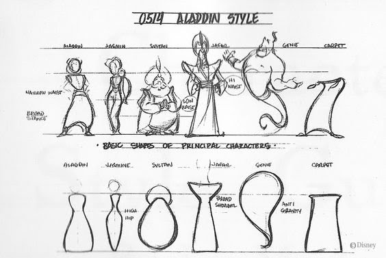 (Aladdin character designs and corresponding shapes - credit: Walt Disney Animation)
 - Silhouette - The design has to be unique and recognisable enough so that if you were just seeing a silhouette of them, you'd still be able to tell who they are. They need to demonstrate clarity and appeal.
 (Various Cartoon Character Silhouettes - image credit: Sporcle)
 - Asymmetry - Making sure the character doesn't look exactly the same on both sides of their body. This leads to blander, less appealing designs. Usually, asymmetry is utilised via the hair or face. Asymmetry can also come from unique poses, and avoiding always having a front on pose.
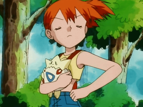 (Misty from the Pokemon anime is an asymmetrical character; her hairstyle throws her symmetry off - credit: Nintendo, 4Kids)
 - Abstraction - How simple can you break the character down to be? Will it's base components give enough of an idea of who they are?
- Appeal - The character should be interesting to look at, be it through simple design choices (shapes, colours, style), or depending on their design complexity (antagonists usually more detailed, protagonists more simple)
(Most of the designs in Hilda have a bouncy, round look to them, making them nicer to look at - credit: Netflix) - Movement - How the character moves should tell us something about them. How they usually feel, their weight, etc. A standard walk cycle can make a character seem dull, so a more animated walk cycle, full of personality, helps communicate more about them.
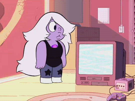
(Amethyst from Steven Universe moves and act much like a child would in this scene, hinting at her more immature, reckless behaviour - credit: Cartoon Network)
(Inside Out shows 4 steps of abstraction, albeit in reverse - credit: Pixar Animation Studios)
CAST 1: Gravity Falls

(The main cast of Gravity Falls - credit: Disney Television Animation)
Immediately, we can see shape theory in play. Soos is primarily made up of circles and rounded edges. From this, we can safely assume that he's meant to be a friendly, caring, safe character. This is correct, as we see in episodes like Soos and the Real Girl and Blendin's Game. Twins Dipper and Mabel Pines both use round shapes, yet Dipper also has some square elements to him. Using this, we can guess both twins are friendly and safe, but Dipper has a more stable element to him. This, again, is true, as seen in Dipper and Mabel vs The Future and Carpet Diem. Grunkle Stan is an example of subversive shape design. He's made up of mostly square shapes, suggesting a more solid, stable figure. However, the show goes out of it's way to show Stan's recklessness, and later on in episodes like Not What He Sees, how trust in him should be questioned. Finally, Wendy uses more triangles than any other protagonist on the show. While she's not got the evil factor that triangles are associated with, she definitely acts a lot more dynamically. In episodes like Weirdmageddon Part 2 and Into The Bunker, she's an athletic, fast-on-her-feet independent.
The silhouettes of the characters are somewhat recognisable, mostly through specific features. Dipper and Mabel, to the untrained eye, would seem almost indistinguishable from each other in silhouette form. However, Dipper wears a large baseball cap, and Mabel has much longer hair and a skirt. Not to mention, Dipper's cap is his most defining detail; Bill Cipher, the show's antagonist, nicknames him Pine Tree because of it. Soos' larger figure and unique head shape make him more recognisable from the other silhouettes, not to mention his leg to body proportions. Stan's broad shoulders, thin legs and fez all contribute towards his silhouette, in order to make him arguably the most recognisable character. Finally, Wendy is probably the least recognisable. Her proportions are somewhat "normal", and fits in with the background characters. Her boots could be a giveaway though; most Gravity Falls extras have legs that fit snugly into their shoes, where Wendy has a lot of room left.
The only asymmetrical elements of characters come from clothes or accessories. Where Dipper and Wendy only have asymmetry in hair flicks, Soos, Mabel and Stan have more noticable asymmetrical details. Stan's fez has a fish(?) design on it, which would flip directions if Stan was fully mirrored. The same can be said for Soos' question mark and Mabel's shooting star, seen on their torso. Plus, Stan is often seen with his 8-Ball cane, which contributes to giving him a more unbalanced look.
CAST 2: Eddsworld
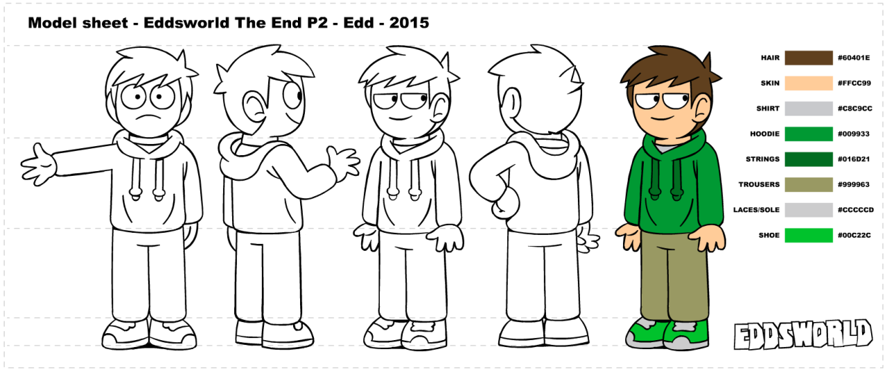
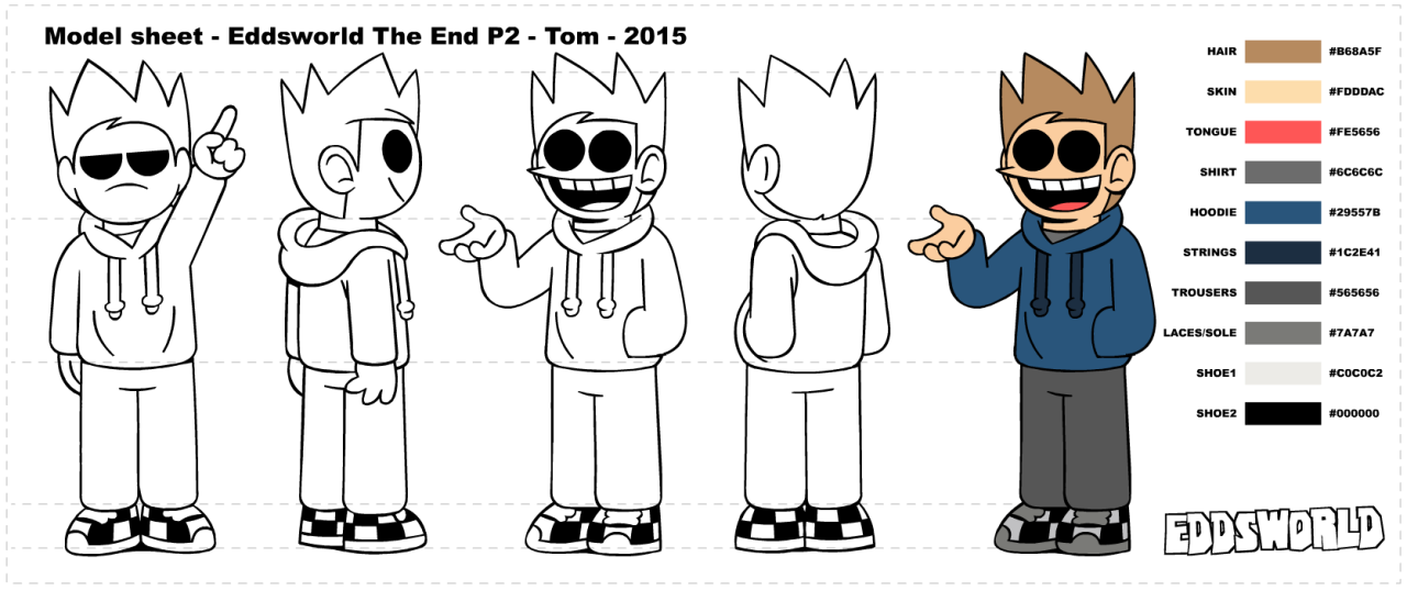

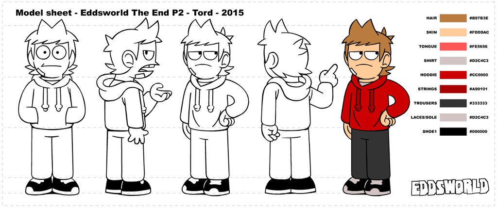
(Individual character sheets for the main characters, created for "Eddsworld: The End" - credit: Paul ter Voorde, Thomas "TomSka" Ridgewell)
Eddsworld main casts, from top to bottom, comprises of Edd, Tom, Matt and Tord.
Despite the original character designs coming from a teenage Edd Gould, we can still see some light elements of shape theory. While all the characters have hair spikes, two characters have an added roundness to theirs; Edd and Tord. Interestingly, this can be seen in different ways for different characters. Edd is the nice guy, he wants to have fun, and is completely carefree. However, he can tend to be reckless sometimes, given the dulled down spike. This shows a more carefree, innocent character with a little bit of edge to them, but not too much. Tord, on the other hand, has the inverse of Edd's hair. It's mostly spike, with a little bit of roundness leading up to it. The design could be a subversive one, given his development from pretending to be friends with everyone to being an enemy. He goes from rounded ally to spiked enemy.
The hair plays a key role in their silhouettes as well. All 4 of the characters wear identical clothes, just with different colourations, so it's up to their natural features to dictate their silhouettes' impact. Edd, Matt, Tom and Tord all have vastly different hair shapes, ranging from flattened, short hair to tall, huge spiked hair. However, the heads themselves also help. They all have some unique aspect to their head shapes too; Matt has a squared jaw, Edd's head is smaller than everyone elses, etc.
Once again, their hairshapes define another attribute of the characters; their asymmetry. Looking at the characters, their hair all seems to lean somewhat. It could be leaning back like Tord's, or forward like Tom's, even when looking at the characters dead on. This helps to give them a more natural feel, and not like they were designed by a machine.
CAST 3: The Legend of Zelda: Majora's Mask
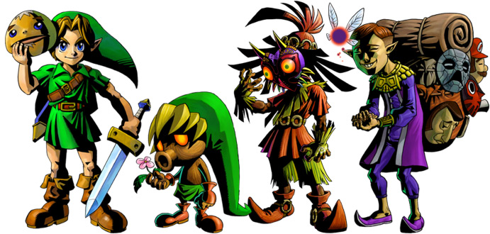
(Link, Deku Link, Skull Kid, Tatl and Mask Salesman - credit: Nintendo)
Majora's Mask consists of 4 main characters: Link, Skull Kid, Tatl and the Mask Salesman. However, Link gets three extra looks to him using transformative masks, being Deku Link (pictured), Goron Link and Zora Link.
Link's shape theory varies from form to form. In his regular human form, he's mostly shown to be made up of squares and triangles. While not evil, this shows his dynamic side, given his athleticism. The squares also represent his stability and sturdiness; appropriate for the "hero of the land". Deku Link and Goron Link both soley use circular shapes; Deku uses it for the cute factor, and Goron uses it for the safety factor (the ability Goron Link gets is increased defence). Zora Link's shapes are influenced by his abilities too; he's mostly made up of triangles. Tatl is made of just one circle. This is another subversive design; Tatl is meant to be a fairy, who help out the Kokiri people like Link. Tatl isn't helpful, and is downright rude most of the time. Skull Kid is an interesting design; where a lot of the base body uses squares, the Mask they wear is made up of many triangles. This can be read as representing what actually happened to Skull Kid; before the mask, he was living feral in the forest with Tatl and Tael (another fairy). However, after finding Majora's Mask, he became corrupted and evil. The Mask's spikes and triangles may resemble this. Finally, the Mask Salesman. His bag contains mostly circles, leading the audience to think that what he's selling is safe and this guy could be friendly. However, the triangular angles on the actual character suggest otherwise; his pointed shoes, his ears, even his facial features are noticeably more angular than other characters.
Their silhouettes are very recognisable through several features. Link has his long, green hat, a sword & a shield, Skull Kid has the flares all over his clothes, plus the spiked Majora's Mask, Tatl could be considered a silhouette already, and the backpack & hunch of the Mask Salesman gives him away. The alternate versions of Link are somewhat more tricky to identify. When Link transforms, he becomes one of the species he's got the mask of. However, this means that his silhouette is identical. Someone could easily mistake Goron Link for just a Goron.
The characters also have some asymmetrical attributes too. Link has a sword and a shield in each hand, as well as a belt strapped around his shoulder. His hat also tends to droop to one side, instead of falling flat onto his back. Skull Kid has his flares somewhat asymmetrical, given that there's no exact pattern or structure to them. The Salesman has his masks on his backpack to give him the sense of asymmetry, with nothing else giving him that. The other 3 Links and Tatl have no defining features to show any kind of asymmetry.
Overall, I'd say this was a good introduction to the unit! I'm really excited to start out, especially since I've been designing characters myself for so long, and now I'm going to be able to learn how to make better ones!
No comments:
Post a Comment